“Who the hell wants to hear actors talk?” –H.M. Warner, Warner Brothers, 1927.
Think out of the box! It’s a buzzword we continuously hear, but not always meditate on its the practical meaning.
What does that really means?
Thinking inside the box means take for granted the status quo
status quo: The existing state of things; leaving things as they are without modification or alteration. “Things” can be anything from visitation arrangements to property rights. www.brandeslaw.com/Legal_dictionary/legal.htm
For example, the opening quote of this article. At that time (1927) silent film was the way the world watched cinema. It may sound ridiculous now how somebody could say something like that. But we could have just about the same reaction in 1990 if someone told us that in the future we would buy merchandise on virtual place named after a South American rain forest using an international computer network.
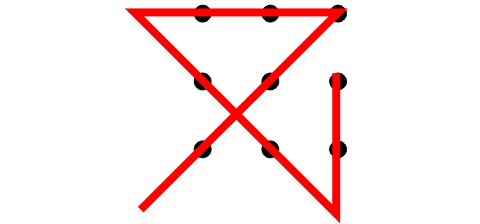
The boundaries of the imaginary box are set by ourselves. Remember the good old puzzle where you had to draw nine spots? Without lifting your pen from the paper, draw four straight lines which go through all the dots.

When you meet the puzzle for the first time, it could be quite challenging because we imagine a boundary around the edge of the dot array (for those smart cookies that solved it straight away: congrats, it took me a while).
The answer is not to be limited by barriers which we have assumed are in place. No one said your lines had to stay within the dots.

The in-the-design-box thinking and how to avoid it
As we can see, we are the ones that put the limits when it comes to solving a problem. When a client hires us to help him with a design, it’s pretty common that the only material we have is a bland business card with a monotone logo and a handling a brochure or website from the competition, telling us he wants something similar.
And the walls from the box have risen.
Which walls?
- The typography constriction
- The color restriction
- The aesthetics status quo
- The client’s spoken and unspoken directives
The Typography constriction
We tend to solve problems the way we did before. But you can’t use Helvetica for every logo or Geneva for every Header.
- Dare new fonts
There are many new ones to try from and lots of free nice ones too. Also, remember you can use more than one font (but try to keep it lower than 4). - Keep in mind the typographic contrast and flow
Create a reading flow and contrast is by the use of: Size, Different Typefaces, Color, Cases, Space, Style & Decoration and Weight.
To Discover New fonts:
http://www.dafont.com/top.php
Popular Free Quality Fonts
http://techmagazine.ws/most-popular-free-quality-fonts/
Typography Contrast and Flow
http://www.webdesignerwall.com/tutorials/typographic-contrast-flow/
Color Restriction
Color restriction is another wall we put in front of us. For example, your client’s logo comes in blue so your first impulse is to do an all-bluish design. Resulting on an unattractive analogous color scheme outcome.
Don’t be afraid of contrast:
Maybe your client asked for a corporative blue site. That doesn’t mean you can’t add contrast to it. You can use complementary colors using the color wheel as reference.
Find Complementary Colors to Gain Contrast
http://design.geckotribe.com/colorwheel/
Extract the Color Pallet from a Photo
http://www.degraeve.com/color-palette/
Color Matching and Palette Design
http://colorblender.com/
The aesthetics status quo
You don’t have to reinvent the wheel every time you do a design. But you can try different approaches for each job. For example, when you have a new task – let’s say a corporative website – you go and see other well-designed corporative websites as inspiration. That is a nice thing to do because you can get some parameters, but instead of just trying to repeat the formula, try to analyze what they are missing and fill that up.
- Ask yourself every design decision:
You don’t have to do the same everyone else is doing. Otherwise your corporative site will end up a white and blue, businessmen shaking hands classic. Why always blue? Why businessmen? - Avoid clichés by using abstractions:
What does your client need to communicate in the first place? Don’t go for the first look, ask for the mission, vision and values.
The clients spoken and unspoken directives
This is a tricky part. There are clients that really want to hear advice from designers as consultants in the visual impact of they business. And there are others who don’t really care and want their logo in comic sans. In either case, here are some recommendations you could use.
- Communicate the value of your consultancy: Tell your client about your experience helping other clients to achieve their goals and how you did it. Let him know the practical reasons of your suggestions.
- Make a blueprint before you start to design: It happens all the time. If you show a polished mock up from a design the client could possible say ‘I hate that shadow effect’, and ignore all the layout, images, vectors, etc. you have. So it saves a lot of work and frustration if you first make a wireframe sketch. So it would be easier to focus on the layout rather than the details.
- Do two or tree mock ups: I always try to show at least 2 options, never more than 3, at least at the same time. If you show just one, they will ask you to see at least one more, even if they love it. But if you show more than 4 it’s very likely you’ll confuse him. And the end result might be a Frankenstein with all the leftovers of the other mock-ups.
- Present a varied range of options: When you are offering two mock-ups, make one of them a more conventional one to satisfy what you client asked for, and in the second one put your vision of what would make a good contrast between the two proposals. Remember to communicate the reasons and the practical implications of your choices.
- Ask what he definitely doesn’t want: Some times when the client isn’t sure of what he wants, it works the other way around: ask what he definitely doesn’t want. Of course it might happen that that is exactly what you in you criteria believe would help. In that case you have the chance to present your point of view.
- Go further than the client’s indications: This is imo the one on the most important points. To go beyond the invisible barriers of what you have been not told. It’s what this article is all about. So don’t limit yourself.
Conclusion
Even if you are not told to do so, it’s your duty to have fresh approaches to the same problems. And what is more important, to go see beyond the unspoken and self imposed imaginary boundaries of the task itself. So the next time you got a blue logo to start with, you might want to add some red.

Great article Mau, I love it!
I find it very well written and based on a real day-to-day issue designers face. I think that even though most designers are aware of those facts sometime we do need a reminder. Your post can totally be a “check list” in order to force ourselves to get out of the freaking box.
Keep up the good work!
Very good article. I really like that quote you used at the beginning. It’s funny now looking back at it, but it just drives home your point. Good suggestions and links.
Thanks 🙂 I had several quotes to quote (if could say that) but choose that one, because I think is perfect illustrations how incredibly wrong can sound “in the box thinking” when you look back.
Great article!
I might also add that you should make sure that the client with which you are dealing is also the final decision maker, and/or that you get the final decision makers to give you the info.
In the last year, I’ve dealt with 2-3 different clients who were not the actual decision maker, but rather a go-between for management or board members.
You’ll save yourself the big time wasted making 3 design mock-ups by the liason’s standards when that of the management is 180 degrees different.
I do not believe this
I’ve only just read this post, it’s great and I could never work out that simple square so frustrating!
But thinking out side of the box designers will seek out strong ideas in order to understand its strength and the viewer will be invigorated, influenced and changed by it.
@Richard Yes, all of us are in that invisible square one way or the other. The first step is to be conciuous of it.
The quote about the boundaries and the example of the box formed from dots is very interesting.