
52 Inspirational T-shirts
We bring to you today a collection of T-shirt designs for your inspiration. It’s interesting to see so many good talents and different styles. Beautiful T-shirts are good sources of references for us. We selected nice tees from 3 different sites. The first one is the Threadless. They have tees from $9.00 (on sale) to $25.00.You can even earn a good money by submitting designs. The second one is called Emptees, which is more like a T-shirts community. The last one is a Brazilian site, Camiseteria , where people can participate, create and vote.


read more…
Design Inspiration: Beautiful Sites Inside-out
Normally when an inspirational post is presented, it is focused on aesthetics. This time I would like to present a PSD to HTML service that has for its slogan “Code is art” – and the pages coded by them are surely beautiful hmtl pieces of code.
Here are some examples. Among them, the acclaimed SmashingMagazine. The link under the screenshot will lead to a divided screen, with the rendered html on the top and the code below.
read more…
Create a Pink and Happy Female Perfume Ad
Hi everyone! I’m here again, this time to show you how to make an ad for a female perfume, pink and happy, using some freebies we can find here at snap2objects.
read more…
Freebie: Design Free Logos Online
When you are going to start a new business or revamp a company’s image, the first thing you need (after selecting a brand name) is a logo. And that could be a long quest, especially when you’re trying to find the right graphic designer at an affordable price. Fortunately you can design your own free logos online that may help you in that not-easy-at-all quest.
read more…
Create A Refreshing Lemon Bottled Water Ad
This tutorial will show how to make an ad mixing different images and techniques in a simple way.
read more…
10 Best and Worst Looking Sites From The Web
You can always find inspiration in lists of best-looking sites, but what about the worst ever? I know, I know that would be harder, to decide among the countless horrendous sites from Geocities or Angelfire, lol – it’s way easier to hand pick the cream of the crop of webdesign.
According to commandshift3.com – Like “hot or not” meets “celebrity death match” – these are the worst and the best looking sites from the web.
Protective glasses are recommended to prevent your retinas from burning.
read more…
21 Chiyogami Seamless Backgrounds
Chiyogami: A highly decorative type of Washi paper (和紙, Washi or Wagami? literally, “Japanese paper”) printed paper used for craft purposes. It was originally printed with wood blocks but now other printing methods such as silk screening are used. Many of the traditional designs can be traced back to the Edo period.
Here are 21 gorgeous and colorful backgrounds free for personal use taken from Flickr. Most of them are from the Chiyogami Monday group. For download and information on license and attribution, please click on the thumbnails.
read more…
Thinking Outside the Design Box
“Who the hell wants to hear actors talk?” –H.M. Warner, Warner Brothers, 1927.
Think out of the box! It’s a buzzword we continuously hear, but not always meditate on its the practical meaning.
What does that really means?
Thinking inside the box means take for granted the status quo
status quo: The existing state of things; leaving things as they are without modification or alteration. “Things” can be anything from visitation arrangements to property rights. www.brandeslaw.com/Legal_dictionary/legal.htm
For example, the opening quote of this article. At that time (1927) silent film was the way the world watched cinema. It may sound ridiculous now how somebody could say something like that. But we could have just about the same reaction in 1990 if someone told us that in the future we would buy merchandise on virtual place named after a South American rain forest using an international computer network.
read more…
How to create a "Fake Vector" image in Photoshop (part II of II)
Hi! I’m here for the second part of the studies about how to make a photo become a fake vector using Photoshop.
read more…
How To Improve Direction in Your Designs
Direction is an often forgotten but never unnoticed principle of design. It is created using some or all of the elements of design—shape, scale, line, value, texture, color and space. Direction can be defined as the movement of the eye throughout a piece. It is an important principle because it guides the viewer through a design; from the first thing they notice on down, across or up to the last object, which should ultimately lead them back into the design so as to keep their eye on the piece.
So how do you position elements to guide your viewer? Take a look at the way the following designs implement the principle of direction.
How to create a "Fake Vector" image in Photoshop (part I of II)
Hi guys! I’m really happy to be here as a guest blogger, I have no words to thank Mao. Well, my name is Estefany and I’m here to give you some tips about working with “fake vectors” on Photoshop. First I’ll be showing you the basics of the main tool we use to work with vectors on Photoshop – Pen Tool – and later we’ll make a photo become a fake vector.
read more…
Design Inspiration: 3rd Edge Portfolio
3rd Edge is a communication firm located in the USA since 1996. Their approach to design is quite clean and clever, and you can tell that as soon as you enter their online portfolio.
read more…
Chris Coyier: The guy who showed us how Beautiful HTML Codes Looks like
For those of you who don’t know him, he is the guy behind css-tricks.com, where he teaches us all the tricks he keeps under the sleeve. Today we have the opportunity to interview him and ask him some questions regarding his approach to the tricky world of CSS.
read more…
Next Thursday Interview with Chris Coyier: The guy who showed us how Beautiful HTML Codes Looks like
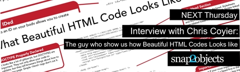
Most of you must remember this great post from css-tricks.com where Chris Coyier showed “What Beautiful HTML Code Looks Like”. For many of us that was how we first met Chris and his full-of-tricks blog.
Well next Thursday he will be here on an interview answering some questions and giving us a few recommendations on how to get not just a “pretty face” in ours designs but also how to be beautiful from the inside.
11 Images you might want to avoid in your designs.
We have been talking about avoiding clichés lately, instead trying to reflect the unique personality of every business. That way our design will stand out among millions.
Sometimes the hardest situations come when our clients ask us to implement some not-so-unique elements and it seems almost impossible to convince him that it would be better to take another direction in order to differentiate his business.
There’s nothing wrong with the use of a specific image (or design trend). The problems come when we use them gratuitously, without asking why it should be there and if it is really conveying an honest portrait.
I will show some images I consider overused, since the beginning of the web, that could make your website (or any design) look generic, unimaginative and dated – if you use them just for the sake of it.
read more…
Elliot Jay Stocks, The guy who told us to "Destroy the web 2.0 look"
After posting about “How to destroy the web2.0 look” I had the pleasure to speak Elliot Jay Stocks, the guy who told us about “Destroy the web2.o look” at the Future of Web Design event held in NY. Elliot answered some questions about the controversial topic. He also told us how he avoids clichés and where his inspiration comes from, among other interesting matters. One thing is for sure: a big part of his success comes from the fact he’s always in the quest for inspiration out of the monitor and has great attitude to learn and collaborate.
read more…
Next Friday: Interview with Elliot Jay Stock
Elliot Jay Stocks is a senior Designer at Carson Systems, a regular writer for industry-leading publications such as .net, a speaker at conferences and events (in his last one he told us to “destroy the Web 2.0 look”), and also a copious blogger at his own blog and at Carsonified.
He gave an interview to this blog that will be published next Friday Dec 7th, where he will answer questions like: how does he avoid cliches? How should we “educate” our clients? What is his design process like?
Meanwhile, I leave you with some of Elliot’s portfolio, which is very prolific and varied. You can see gorgeous works for big names like the Pet Shop Boys and Massive Attack on his portfolio. I find them very inspiring because of the richness in texture and detail. I hope you enjoy them and stay tuned for the interview next friday.
read more…
16 Beautiful, Simple and Cliché-free Websites
In my last post, “How To Destroy The Web 2.0 Look” based on Elliot Jay Stocks’ proposal, I showed some sites that illustrate an opposing trend to the current popular style. This new look has rich textures and an organic feel. The purpose behind these designs is to come up with different web design approaches that to try to build up and express the each site’s personality. Now, in contrast, I would like to show 16 Beautiful, Simple Websites that are clearly influenced by the “W2L” a.k.a. “Web 2.0 Look” (brilliant contrasting colors, central layouts and big text) but you won’t see any Diagonal Lines, reflections nor “Special offer” badges while maintaining that sleek feeling from W2L.
So, we see that you can embrace trends without falling into their specific clichés. Here we see that we can still incorporate beautiful, clean designs without being a Photoshop artist.
read more…